
Looking for Connections

Visual Analytics, or the use of informatics and graphical techniques to allow for guided exploration of complex data, is a powerful component of big data exploitation. In this vein, the Software Processes group is exploring the limits of Visual Analytics in multiple domains including in categorizations of the VA VistA EHR and in the exploration of relationships between multiple sources of data — patient demographics, symptoms, case histories and medical image derived features — in predicting individual patient health trajectories.
There is no question that Jason Li's work on VIVIANTM (Visualizing VistA And Namespace) for the OSHERA project has been met with great excitement from the VistA development community. The VIVIANTM tools provide insight into the structure and interactions of the 40 year old, >26,000 file VA legacy Electronic Health Record (EHR) code. Developed for internal use by OSEHRA in managing the VA open source repository, the VIVIANTM suite has proven even more popular with the development community providing them with resources that had been missing since the inception of VistA.
Below are a few examples of the visualizations that Jason has been working on. The first is a hierarchical view of VistA packages organized by application area. Interactions allow the tree to be expanded or collapsed. Clicking on a file brings up additonal information derived directly from the source code or code repository and allowing for the self-documentation of an extremely complicated codebase. The second illustration is an interaction diagram showing the package to package relationships. As the user hovers over a specific package, calls into the package are highlighted by a red arc and calls out of the package are highlighted by green arcs. The pattern of interactions and the illustrated call graph provide insight into the interconnectivity patterns that cannot be obtained by simply looking a flat textual representations. Again, clicking on a package will bring you to more detailed information and specifications.
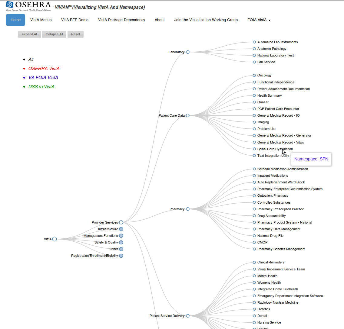
Trying to understand the intricacies of a large legacy system is not an easy task. Wading through thousands (literally, in this case) of files to attempt to figure out if this code change will break something downstream is tedious and error-prone. Using these tools, developers are able to quickly and easily understand the relationship between sections of the large and complicated code base.
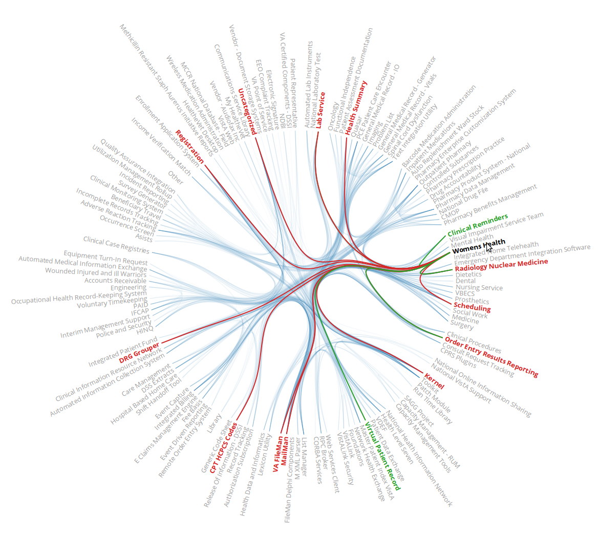
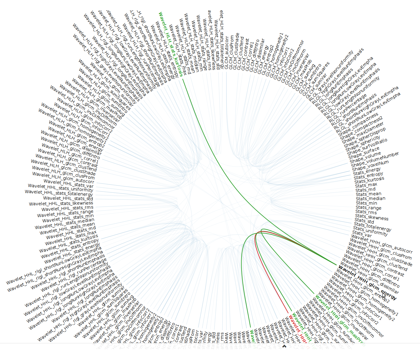
But VIVIANTM is only the beginning. When beginning to prepare for the NIH NCMS P41: National Center for Multi Systems demo, we faced the challenge of finding connections between large sets of patient and medical imaging derived data. In particular, we needed to demonstrate a unique way for researchers to look at the data and see possible connections with fresh eyes. Knowing that Jason's work not only looked interesting but was proving to provide real insight, we asked the question "Would it be possible to re-use the powerful graphics he had already developed?"
The answer, of course, is yes. Working with our collaborators, such as noted researcher Hugo Aerts, PhD, Assistant Professor of Radiation Oncology Harvard Medical School and of Brigham and Women's Hospital Dana Farber Cancer Institute; we were able to generate some demo data representing imaging and nonimaging disease presentations. Not only was the edge bundling visualization adapted for the demonstration but it was also placed into the Tangelo-Hub (Arbor) framework for general use.
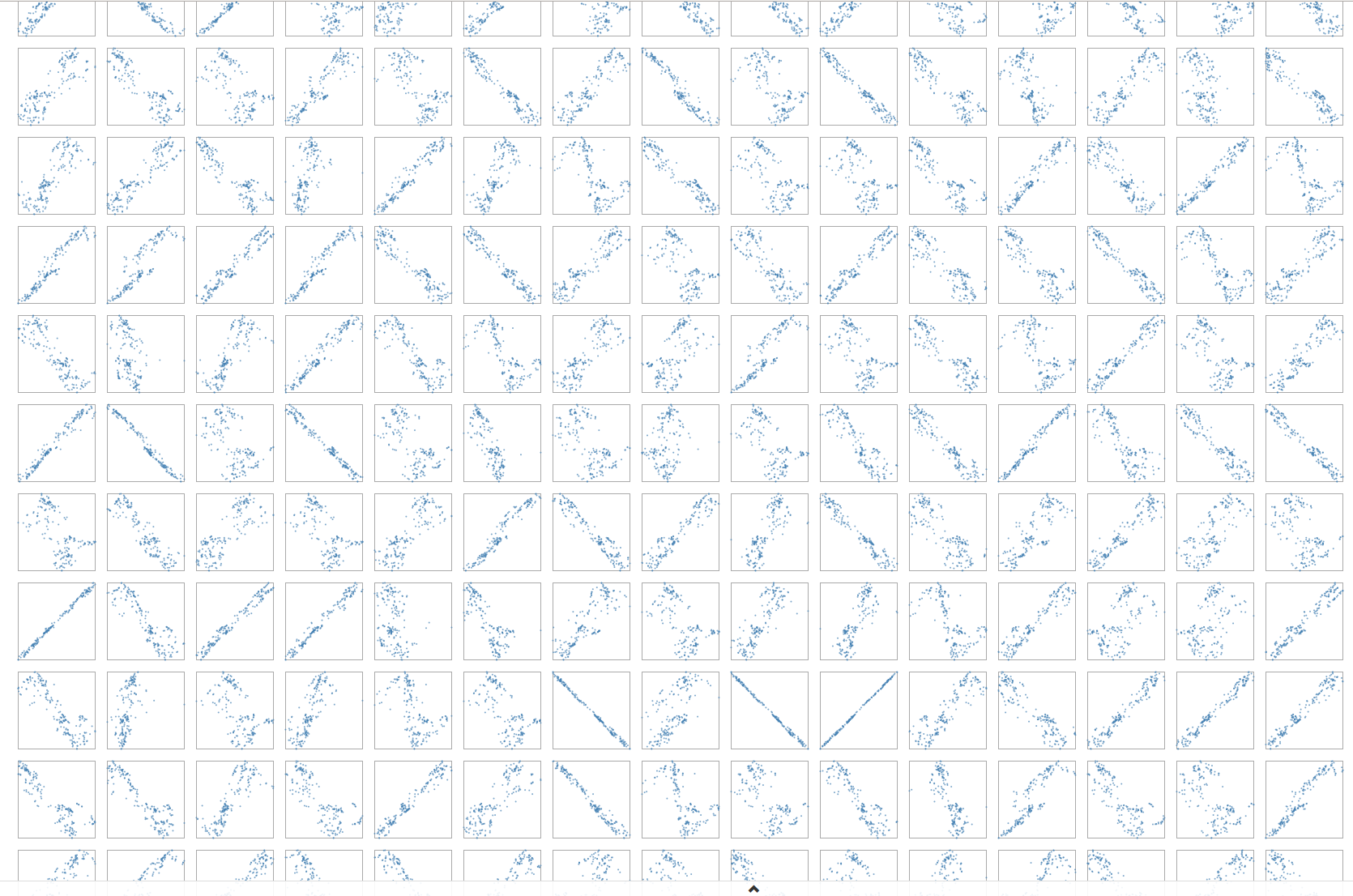
 Continuing to explore other Visual Analytics solutions, we next turned to a matrix of scatterplots. At the start, viewers are presented with a high-level, birds-eye view. Are there any patterns? Much like the edge bundling graph, positive and negative correlations can easily be seen. While selecting specific blocks make it possible to drill down and look at those graphs that might be interesting in more detail.
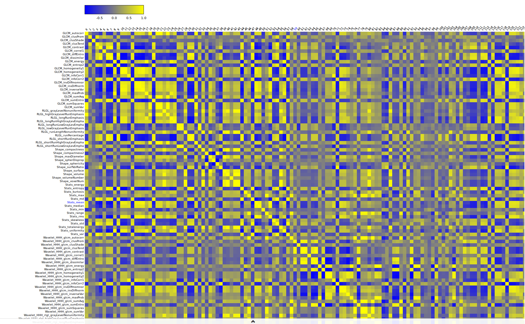
Finally, we developed an interactive heatmap. The interesting aspect of this visualization is the ability to sort data by rows and columns. By shuffling data, new patterns emerge.
We believe that we have only begun to explore the landscape of data representation. What other applications could these simple yet powerful visualizations be applied to?