
Resonant Lab Extends Data Visualization to the Masses

![]() In today’s world, data is everywhere. Scientific research, financial analysis, and marketing campaigns produce massive amounts of data. As the data available grows, so too does the possibility that it becomes misunderstood, which leads to frustration. Any researcher who has had their results misrepresented in the news knows this frustration. The answer lies in data visualization, as it can clearly communicate complex topics.
In today’s world, data is everywhere. Scientific research, financial analysis, and marketing campaigns produce massive amounts of data. As the data available grows, so too does the possibility that it becomes misunderstood, which leads to frustration. Any researcher who has had their results misrepresented in the news knows this frustration. The answer lies in data visualization, as it can clearly communicate complex topics.
Web-based, interactive visualization tools aid comprehension and offer hands-on data exploration. While many open-source web-based tools can create different types of visualizations, most call for advanced knowledge of computer programming to set up. Further, while developers build many new tools, these tools often remain relatively unknown. They appear complex and do not reach wide audiences. Big Data poses big problems as well. Imperfect and incomplete datasets, for instance, become challenging to represent. In addition, the analysis of these datasets requires distributed databases, statistical sampling methods, and new algorithms.
To solve these problems, Kitware has teamed with the XDATA program of the Defense Advanced Research Projects Agency (DARPA) to create Resonant, an open-source platform for data management, analytics, and visualization. Resonant has several components, which come together in Resonant Lab. This easy-to-use, web-based tool provides a point-and-click interface that removes the barriers to entry for data visualization. The tool applies to a wide variety of fields such as healthcare and climate science, among others.
Resonant Lab comes out-of-the-box with commonly used visualization types like scatter plot, histogram, and line chart. The tool makes it easy to switch between visualizations to answer many different questions with the same dataset. To highlight the ability of Resonant Lab to illustrate trends such as fuel economy, this article provides an in-depth look at how to create a visualization with example data.
Using Resonant Lab
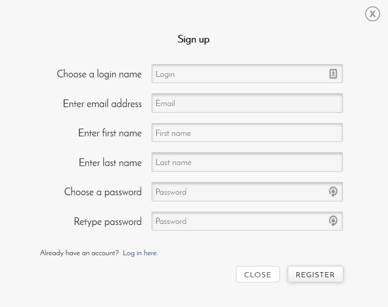
Kitware has made it easy to try out Resonant Lab through https://resonantlab.kitware.com. Once Resonant Lab opens on the website, it provides links to register for or log in to an account. While the use of the tool does not necessitate an account, an account allows Resonant Lab to upload files from a computer.
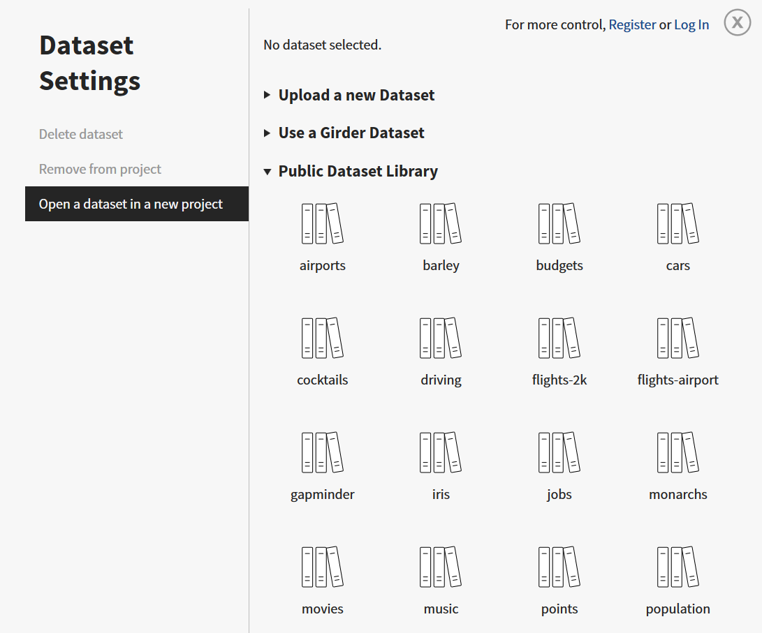
In addition to links to register for or log in to an account, Resonant Lab displays options to create a new project and upload data, start with a visualization, or begin with a dataset from the public library of standard examples. This article explores the “cars” dataset, which contains information about several makes of consumer automobiles across various model years. The dataset includes information that pertains to automobile construction (e.g., weight, number of cylinders, and engine displacement) and performance (e.g., gas mileage, maximum power output, and zero-to-sixty acceleration time).
After Resonant Lab opens a dataset such as “cars,” it displays three main panels: Dataset, Data Matching, and Visualization.
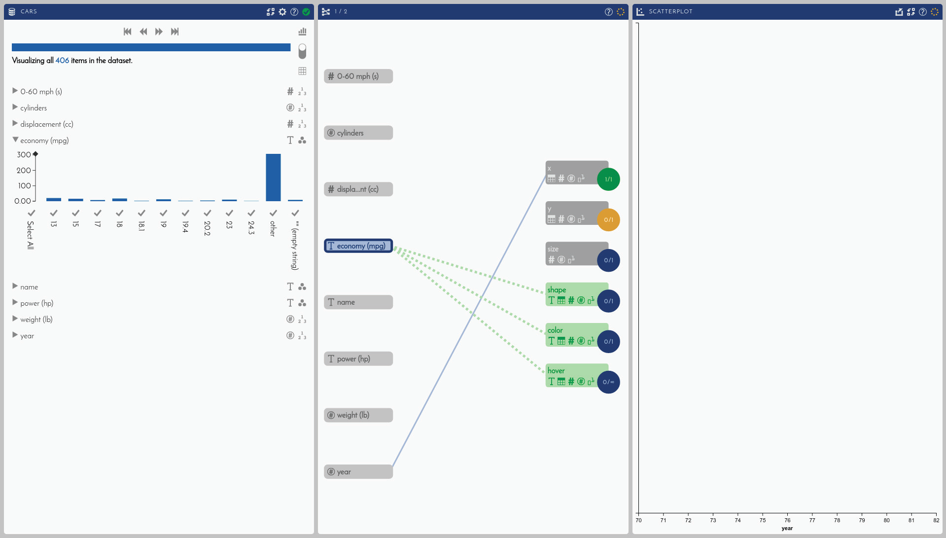
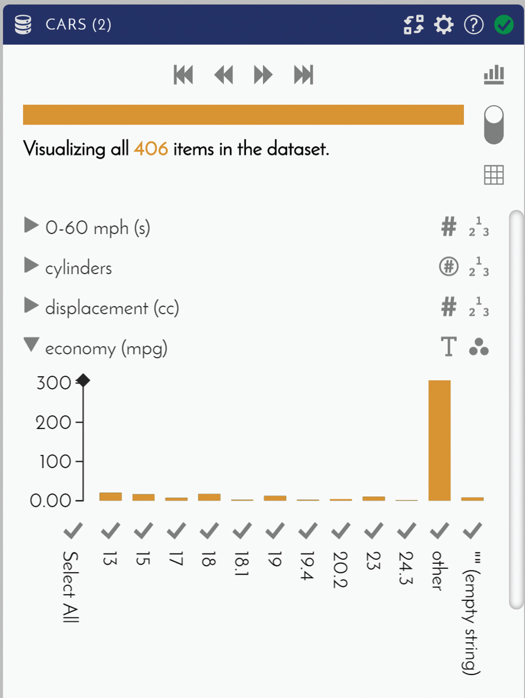
In the Dataset panel, Resonant Lab can expand each component of the “cars” dataset to display a histogram of its content and provide an inside look into the data.
In the Visualization panel, Resonant Lab requires the selection of a visualization type. Once Resonant Lab receives this selection, it needs instructions on which visual attributes it should map to the components of the dataset. Mapping involves clicking on a component such as “economy (mpg)” and then clicking on one or more of the available attributes. To simplify the mapping process, Resonant Lab highlights the available attributes for a given component in light green.
The type of visualization determines the available attributes. For example, scatter plot has the following attributes: “x-axis,” “y-axis,” “size,” “shape,” “color,” and “labels.” The data type further limits these choices. Resonant Lab can only map “x-axis” and “y-axis,” for instance, to data types with numeric values. For the “cars” dataset, “economy (mpg)” contains an “(empty string)” value. Accordingly, Resonant Lab automatically detects the data type for “economy (mpg)” as text. This data type prevents Resonant Lab from mapping “economy (mpg)” to “x-axis” or “y-axis.” Since cars measure fuel economy in mpg, however, “economy (mpg)” should instead use the “Number” data type. Clicking on the data type indicator to override “Autodetect” with “Number” treats the missing, empty string data as “not a number” values and the known data as numeric values. With this override, Resonant Lab can successfully map “economy (mpg)” to an axis.
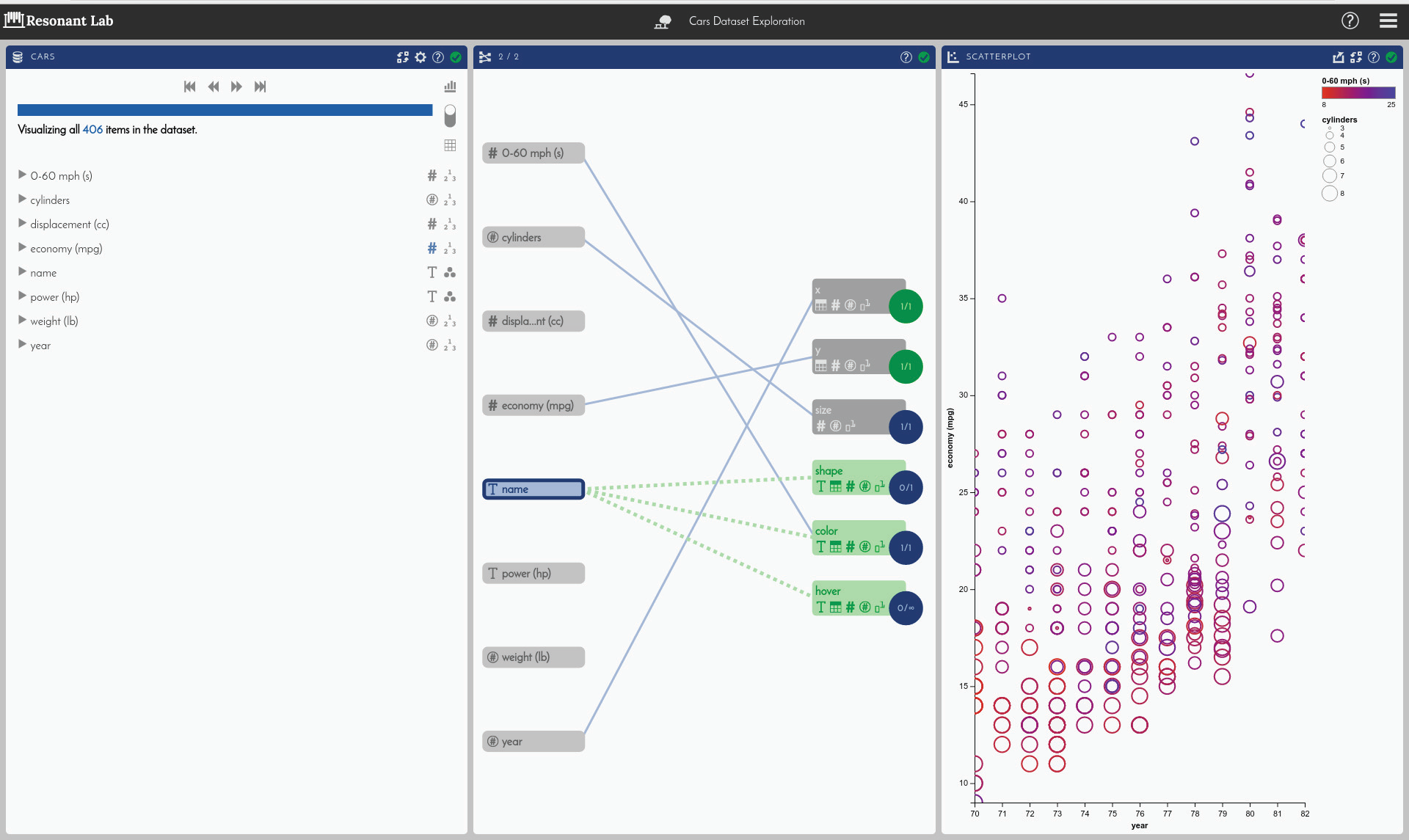
Mapping “year” to “x-axis,” “economy (mpg)” to “y-axis,” “0–60 mph (s)” to “color,” and “cylinders” to “size” creates a scatter plot of the “cars” dataset that shows a clear trend of how fuel economy has changed over time. Resonant Lab can further drill down into the details of the dataset. After mapping “economy (mpg)” to “hover” and hovering over a data point, for example, Resonant Lab can display the make and the model of the car for that point.
The above scatter plot may help a salesman who wants to convince a potential buyer that a new fuel-efficient car is the way to go. Nevertheless, the scatter plot may not do much for the salesman, if the potential buyer wants to compare features to buy a used car. In this situation, the salesman may want to switch to another visualization type. Resonant Lab makes it easy to do so. Clicking on the “switch visualization” icon () in the Visualization panel brings up the option to select a different type of visualization. Resonant Lab automatically loads the mapping attributes that correspond to the new visualization.
A LineUp visualization can better compare features of used cars with dynamic, interactive, weighted comparisons. Instead of axes, a LineUp visualization sorts data in columns by relative importance. Wider columns denote heavier weights than thinner columns. For the “cars” dataset, LineUp weights the”economy (mpg)” column the heaviest.
Suiting Needs in Different Industries
Beyond LineUp, Kitware has added visualization types such as UpSet to Resonant Lab. An UpSet visualization displays a matrix of dataset intersections to quantitatively evaluate how datasets relate to one another. Kitware can help to further customize Resonant Lab to meet industry-specific needs in areas such as natural language processing, geospatial and scientific visualization, and software process. To tailor Resonant Lab to specific workflows, Kitware offers consulting and support services. To obtain information on these services, please email kitware@kitware.com.
The website for the Resonant platform offers additional information on Resonant Lab. It also contains overviews of the various components of the Resonant platform. To learn more about the Resonant Lab application and the Resonant platform, please visit http://resonant.kitware.com.
 Libby Rose is a business development representative at Kitware. She received a B.S. in Computer Science from Rensselaer Polytechnic Institute and an MBA from The College of Saint Rose. She has prior experience as an engineer and as a consultant.
 Roni Choudhury is a senior research and development engineer at Kitware. His work has incorporated ray tracing, information visualization, and simulation.
 Alex Bigelow is a student at the University of Utah who is pursuing a doctoral degree in computing. He works as a research assistant at the Scientific Computing and Imaging (SCI) Institute at the university.