Resonant Visualization with Candela
This is a continuation of our series of posts about Resonant, a data analytics and visualization platform for the web.
Posts in this series:
Understanding the Resonant Platform
Girder Applications: An Inside Look
Girder Worker and the COVALIC Grand Challenge
Geospatial Visualization with GeoJS
Resonant Visualization with Candela
Recapping Resonant
Visualization is an integral part of the data science pipeline, offering images that can unlock understanding and insight from often large batches of raw or processed data. Previous posts in this series have highlighted some of the various ways we can perform visualization within the Resonant platform. In this article, we’ll be taking a close look at Candela, Resonant’s API and toolkit library for constructing, adapting, publishing, and using powerful visualization components.
What is Candela?
Candela, in short, is a JavaScript library that provides reusable visualization components for the web. Let’s break this down a bit:
- Reusable – following some of the oldest principles of software engineering, Candela provides a general API not tied to any particular framework or library, so the components you create with it can be ported from application to application very easily.
- Visualization – that general API does not provide many constraints; the main one is that you must implement a function called render() which will carry out your visualization semantics, whatever they may be.
- Components – we use object-oriented concepts to implement the notion of a visualization component; the general API means these components can be instantiated almost anywhere: in a standalone webpage, online documentation, a dynamic web application, an R Studio session, a Jupyter notebook session, or even in a Node script.
- For the web – Candela uses modern JavaScript, taking advantage of ES2015 features and modern tooling (Webpack, NPM with semantic-release, and specially exported bindings to ease integrating into your own Webpack builds) to produce a library that can be used to do visualization almost anywhere on the web.
This article will demonstrate how to use Candela to construct a basic visualization, and hint at some of the more advanced options Candela offers as well.
Making a Line Chart
Candela ships with several general-purpose visualization components that are ready to use. To try one out, we’ll need to set up a short HTML document that imports the library, reads in some data, establishes a place to put a component, and then hooks everything together.
The data we will use is a short CSV file containing various data about Star Trek: The Next Generation episodes. To get started, create a directory somewhere, move into it, and then download the data:
$ curl -O https://www.kitware.com/main/wp-content/uploads/2016/10/episodes.csv
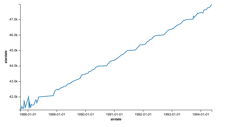
Among other things, this dataset contains information about both the real-world airdate, and the in-universe “stardate” of each episode. Maybe there’s an interesting correlation between these values.
Now let’s create a webpage to do the visualization. Just to keep things simple, we’ll do everything in a single HTML file. You can copy this into an index.html file; here it is:
<!doctype html>
<title>Candela - Star Trek: TNG Star Dates</title>
<script src="https://unpkg.com/candela@0.6.2"></script>
<script src="https://d3js.org/d3.v3.min.js"></script>

<div id="vis"></div>

<script>
var row = function (d) {
  return {
    airdate: d.Airdate,
    stardate: +d.Stardate,
    title: d.Title
  };
};

var data = d3.csv('episodes.csv', row, function (episodes) {
  episodes.forEach(function (d, i) {
    if (d.stardate === 0) {
      d.stardate = episodes[i - 1].stardate;
    }
  });

  console.log(episodes);

  var el = document.getElementById('vis');

  console.log(el);

  var vis = new candela.components.LineChart(el, {
    data: episodes,
    x: 'airdate',
    y: ['stardate'],
    hover: ['title', 'airdate', 'stardate'],
    width: 700,
    height: 400
  });
  vis.render();
});
</script>
Here is a line-by-line explanation of what this code does:
-
<script src="https://unpkg.com/candela@0.6.2"></script>
Line 3: This imports the Candela library file using the Unpkg CDN, which serves content directly from the NPM registry.
-
<script src="https://d3js.org/d3.v3.min.js"></script>
Line 4: We will be using D3’s handy functions for retrieving and parsing CSV data.
-
<div id="vis"></div>
Line 6: This div element will be where we place our Candela visualization component.
-
var row = function (d) {
  return {
    airdate: d.Airdate,
    stardate: +d.Stardate,
    title: d.Title
  };
};
Lines 9-15: This function will be used by D3 to transform the CSV results – we want to convert the “stardate” to a floating point number, while leaving everything else as is.
-
var data = d3.csv('episodes.csv', row, function (episodes) {Line 17: Here, we are using d3’s CSV function to issue an ajax request for the data, passing along the “row” function to postprocess it, and a callback function to execute when the data becomes available.
-
  episodes.forEach(function (d, i) {
    if (d.stardate === 0) {
      d.stardate = episodes[i - 1].stardate;
    }
  });
Lines 18-22: We need to “patch” our data a bit – some episodes never mention a stardate, so to avoid seeing spurious “stardate 0” values we simply assign such episodes to have the same stardate as the episode preceding.
-
var el = document.getElementById('vis');Line 26: This gets a reference to the div element we prepared earlier to house the visualization.
-
  var vis = new candela.components.LineChart(el, {
    data: episodes,
    x: 'airdate',
    y: ['stardate'],
    hover: ['title', 'airdate', 'stardate'],
    width: 700,
    height: 400
  });
Line 30: This instantiates the visualization component. We want to plot a line chart of the episode stardates as a function of the episode air dates. Further detail about this function call follows.
- Line 30: The first argument to the LineChart constructor is the DOM element where we want to put our component.
- Line 31: We supply the data array that came back from D3 as the data for this component.
- Line 32: The name of the column to use for the x-coordinate.
- Line 33: An array of column names to use for the y-coordinates. Each column specified here results in an additional line being drawn in the chart.
- Line 34: Passing a “hover” option allows us to drill down into the data a bit by mousing over points on the chart. In this case, we want to see the exact values being plotted, as well as the name of the episode at each point.
-
vis.render();
Line 38: This explicitly triggers Candela to construct and render the actual visualization.
That’s all there is to it! To see the results you will need some way to serve this directory to the web. One easy way is to use Python’s built-in SimpleHTTPServer:
$ python -m SimpleHTTPServer 8000
Then, point your browser to http://localhost:8000 and you should see an interactive line chart appear after a moment.
This chart shows that generally speaking, episodes of Star Trek: The Next Generation have monotonically rising stardates. But, early on you can see very little correlation between the airdate and the episode stardate – apparently the production team and writers hadn’t decided yet how to assign stardates to episodes.
Candela ships with several chart types, of which the line chart in the example above is just one choice. There is also a bar chart, box plot, bullet chart, Gantt chart, heatmap, and scatter plot, in addition to a selection of research visualizations coming from some of the research groups we have worked with. These include LineUp (an interactive ranking visualization tool developed at Harvard), UpSet (a visualization for exploring relationships among sets of data, also developed at Harvard), and OnSet (a different approach to set relationship visualization, developed at Georgia Tech). Candela’s general purpose API offers enough flexibility to embrace all these different kinds of visualizations.
Advanced Topics: A Preview
You can get a lot out of Candela just using the visualization components it ships with as in the example above. However, Candela offers many more advanced features as well. Here we take a brief look at some of them; future articles will go into more detail on how to become a Candela power user using these features and others.
Creating Your Own Components
Candela’s API for visualization components is simple and flexible – essentially, you have to implement a render() and that’s about it. Optionally, you can implement a constructor to initialize component state, and of course you may want to implement other helper methods, etc. Here’s an overly simple “visualization” component that shows what this might look like:
class Message extends VisComponent {
  constructor (el, value) {
    super(el);

    this.update(value);
    this.render();
  }

  update (value) {
    this.value = value;
  }

  selectMessage () {
    if (this.value < 0) {
      return 'Negative!';
    } else if (this.value === 0) {
      return 'Zero!!';
    } else {
      return 'Positive!!!';
    }
  }

  render () {
    this.el.innerHTML = this.selectMessage();
  }
}
Using Your Favorite View Framework
Because Candela is framework-agnostic, and the API is so minimal, Candela fits well with many different view frameworks. The essential idea is to instantiate a Candela component in whatever “initialize” slot your framework uses, and to call its render method in the framework’s “render” slot.
Using Mixins to Supercharge Your Components
Candela offers several “mixins” to modify or augment the behavior of visualization components. You can use these mixins to adapt the behavior of an existing component, or to aid in the creation of new ones.
For example, the Events mixin adds basic event handling to any component. You might use this mixin to deliver asynchronous events bearing new data from a dynamic data source to update a running visualization.
Mixins take the form of JavaScript functions that modify a class. For example, to apply the Events mixin, you might derive a class from Events(VisComponent) instead of just VisComponent. To add the functionality to an existing component: Events(LineChart), etc.
A future article will go in-depth with this notion, designing a dynamic line chart to create a live view of changing data.
Using Candela in Other Computing Environments
Because of Candela’s modularized component design, we can export Candela visualizations to non-web environments via convenient language bindings. Currently, Candela supports both R and Python, offering all of its visualization components for use in these environments.
Python Bindings for Jupyter Notebooks
IPython Jupyter Notebooks are a popular environment for recording a computation session for sharing with others, or to serve as notes, etc. Jupyter Notebooks are browser-based interactive Python sessions, so as such, Candela components can be directly displayed in their output cells.
import pycandela

data = [{'a': d, 'b': d} for d in range(10)]

pycandela.components.LineChart(data=data, x='a', y=['b'], width=700, height=400)
R Bindings via HTMLWidgets
R is a popular, open-source environment for carrying out statistical computation. All Candela components are accessible in R as HTMLWidgets, which in turn can be used to output HTML from any R console (and can be displayed directly inside the R Studio application). The following short session will demonstrate R’s capability for displaying Candela components:
library(candela)
candela('LineChart', data=mtcars, x='mpg', y=list('wt'), color='disp')
This will pop up a browser window displaying a line chart showing weight as a function of fuel efficiency using a cars dataset.
A future article will go into more detail about these modes of operation.
Candela: The Visualization Soul of Resonant
Candela represents a kind of one-stop shop for visualization needs when developing applications using the Resonant platform. We are working hard on expanding the list of included visualization components, but Candela’s flexible and general API means you can import existing visualizations into your applications, adapt a different version of an included component, or create your own components as needed.
With Candela you can illuminate your data! For more information, please see Candela’s GitHub repository and documentation, or contact us directly at kitware@kitware.com to discuss how we may be able to work together to solve your problems.