Geospatial Visualizations in GeoJS

This is a continuation of our series of posts about Resonant, a data analytics and visualization platform for the web.
Posts in this series:
Understanding the Resonant Platform
Girder Applications: An Inside Look
Girder Worker and the COVALIC Grand Challenge
Geospatial Visualization with GeoJS
Resonant Visualization with Candela
Recapping Resonant
GeoJS is a flexible javascript library for all kinds of geospatial visualizations from traditional point markers to 3D climatological simulations. GeoJS can easily display maps, high-resolution medical slides, or other tiled images. The library is designed for high-speed and large volume; it can handle millions of points or other large data sets. It uses WebGL for graphics acceleration, falling back to native browser rendering when necessary.
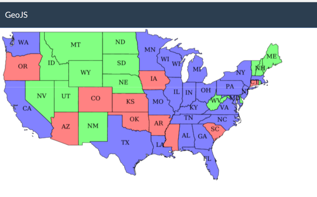
Some examples of using GeoJS showing different types of tiled images:
Maps from different sources and with lots of different options:
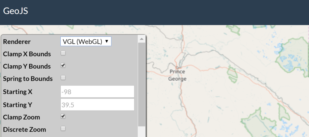
http://opengeoscience.github.io/geojs/examples/tiles
Scans of medical slides:
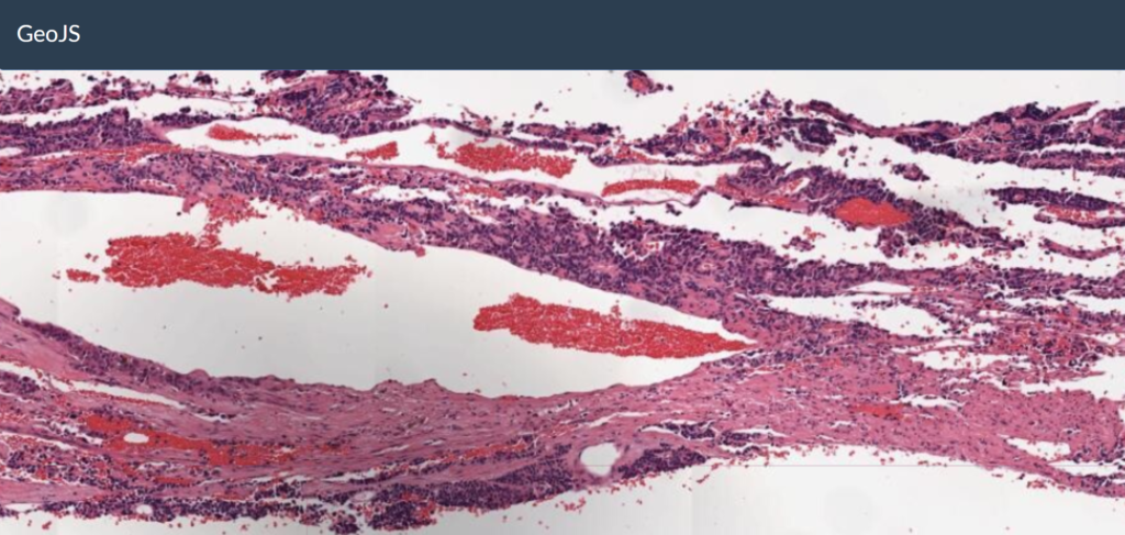
http://opengeoscience.github.io/geojs/examples/deepzoom
Tiles that are generated on demand by a server, such as data from WMS:
http://opengeoscience.github.io/geojs/examples/wms
Visualizations are made of more than just maps and images. A wide variety of data can be placed on top of maps (or even without a base image).
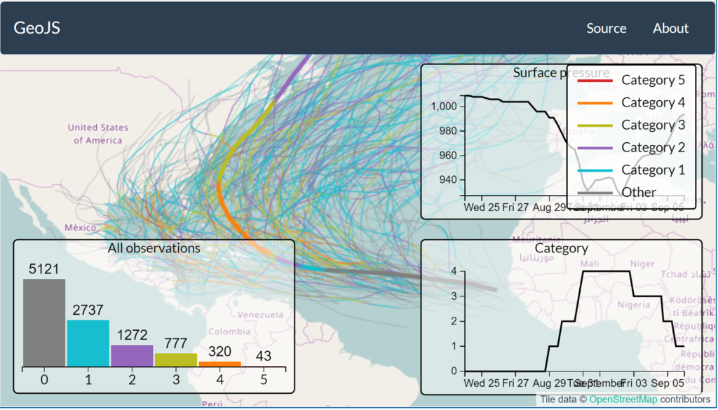
For example, http://opengeoscience.github.io/geojs/examples/hurricanes shows the paths of hurricanes from 1980 to 2014. In addition to the traditional zoom, pan, and rotation of the map, GeoJS allows for more novel features lacking in most vis libraries. The track of the hurricane shows its magnitude at different locations by changing color, and hovering over a specific hurricane’s path shows information about that hurricane in a graph on the side.
Large amounts of data can be displayed in a variety ways. It can be summarized as a heatmap, such as http://opengeoscience.github.io/geojs/examples/heatmap/?dataset=earthquakes&radius=0 which shows the location of all earthquakes on record through April, 2016. Because there are more than a million points, the data is aggregated for just the part of the map currently being displayed. Zoom in for more precision and detail.
Another way to show large amounts of data is by sampling it. http://demo.kitware.com/minerva shows mostly taxi trips in New York City from 2013 (and also transportation data from Boston and Washington, D.C.). There are over 190 million data points, but by taking a random sample, the overall data structure appears. The data is stored in Girder, with a plugin handling the sampling. The net taxi pickups and dropoffs can be shown throughout the week. This can be animated, with blue showing where more people were picked up by taxis and yellow showing where more were dropped off.
GeoJS can also handle multiple data sets. http://demo.kitware.com/bostonpermits provides comparisons from a variety of municipal data sets from Boston. This shows the overlap between construction, code violations, and crime. In this example, all of the data is stored in Girder, and some custom endpoints return the requested information for plotting in GeoJS.
These are just a few examples of geospatial visualization with GeoJS. To learn more about how GeoJS can benefit your project, email kitware@kitware.com.